

THIS IS digit-ALL’s FOURTH ARTICLE IN A FIVE-PART SERIES ABOUT COMPANY BRANDING AND BRAND CONSISTENCY.
Strong, consistent branding helps companies stand out in customers’ and future customers’ minds. If you missed our previous article discussing this, read it before reading this one. Because consistent branding is so very important, it’s not surprising to hear that 94% of companies that were surveyed say they have brand guidelines. Great! Now, where do you start as you develop brand guidelines?
First of all, your brand guidelines are more than which font to use and the HEX numbers that match your colors (although you need those, too!). As you create brand guidelines, also known as a brand guidebook or style guide, you need to think about the following:
- What do I need to keep consistent in order to create a consistent brand image, voice, and presence?
- What do people who work for me and with me need to know and should not need to contact me about?
- What is available in multiple places (our website, our employee handbook, a Post-It note on my computer screen) that would work better all in one place?
Now that you know how to think about what to put into the brand guidelines, let’s now look at the next part. These are the main sections you should have:
Your Mission Statement, Your Vision Statement, Your Core Values, and Your Tagline(s)
We covered how important a mission statement, vision statement, and core values are to your brand. These items should also be in your brand guidelines. This helps you and those who work on your brand always be centered on the “Why” behind what you do. If you lose sight of the “why,” you lose sight of the brand, per Simon Sinek’s Start with Why.
Your tagline(s) would stem from these statements and values, and should also be included in the brand guidelines. (Plus, you don’t want anyone to waste time brainstorming new ones when you already have a vetted tagline!)
Your Target Audience
Most people want everyone to like them. This is human nature. But it is unrealistic, especially as someone who has a brand. It is especially unrealistic now, when company values are more important to consumers than ever before. A reported 64% of consumers say shared values are the number one reason they create a relationship with a brand.
This is why you want to look at who your target market/customer personas are. For instance, would a gourmet meat delivery service have vegetarians and vegans in their target audience? Would a video game company marketing a car chase game have toddlers in their target market? For more on how to develop a persona, look at Hubspot’s guide and templates.
Your Color Palette/Typefaces/Iconography
McDonald’s golden arches are a very specific yellow: HEX #FFC72C. In fact, the brand has a color palette of yellow, red, and black, all with their specific HEX numbers. This helps make sure their ads, their brochures, their packaging, and even internal memos have the same strong brand identity throughout.
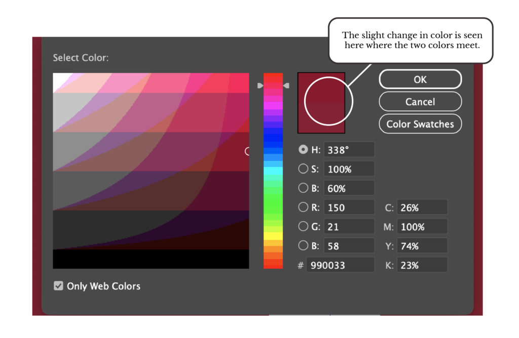
As you create a palette for your brand, it is imperative to stick to the colors you have as your palette. Even small changes can make consumers feel like the brand is not consistent enough to get their trust and their dollars. So make sure that you have a CMYK palette for print and an RGB palette for screens that match as closely as possible (see the image below to see the slight discrepancy in color for the “same” color).
Consistency is also important with the fonts, or more precisely the typefaces, you use for your brand. Starbucks uses three typefaces, and they have those three in its brand guidelines: Sodo Sans (for body copy), Lander (for accent copy), and Pike (for headlines and titles). No one can argue that Starbucks doesn’t have a very strong brand (maybe partly due to those consistent typefaces!).
Iconography are the icons you use throughout your website, your app, and your marketing materials. Icons could include a telephone for calling the company or a letter for emailing the company. They should not be interchangeable icons, but the same icons across materials and modes of communication.
Your Logo
Including your logo in your branding guidelines seems like a no-brainer. But be aware that logos need to be used in different ways:
- A white one for a dark background
- A black one for a light background
- A full-color version
- A logo with the name of the company as part of the logo
Really think about how your logo might be used, including in vertical or horizontal positions, or in very large (billboards!) and very small (favicons and branded swag) situations. Doing so will avoid an unnecessary email or phone call from a panicked partner.
Your Internal Photography
Having a library of professional, consistently formatted company photos may be the missing part of your current brand guidelines. How do you want your day-to-day business to be portrayed? Do you want to best impress your customers and future customers with a picture of your building when the maple trees out front are at peak color change? Do you want your company to be seen in an informal light (with company meetings taking place with workers in jeans and t-shirts) or a more formal light (khakis and button-downs)?
Also, do you want images of your workers at the ready-for bylines and bios when they write a blog post, a guest article for an industry journal, or a social media post congratulating someone on a job milestone?
Having these images in your brand guidelines will take away an inadvertent inconsistency!
Your Editorial Style
Even if you don’t think you’re a text-heavy company, this will keep the text on your website, brochures, and social media looking consistent. Some editorial style guidelines might be:
- Refer to the Chicago Manual of Style, 3rd Edition, for how to stylize numbers, captions, and other issues that come up in the text.
- Write the company name as eZmachinery and never EZmachinery.
- Use 12-point square bullets in black for bulleted lists across all media.
Your Brand Personality/Voice Across Copy and Platforms
There is a time and a place for how we speak to people. The same holds true with the tone/voice/brand personality a company uses in a video or in text, and not all situations are made the same.
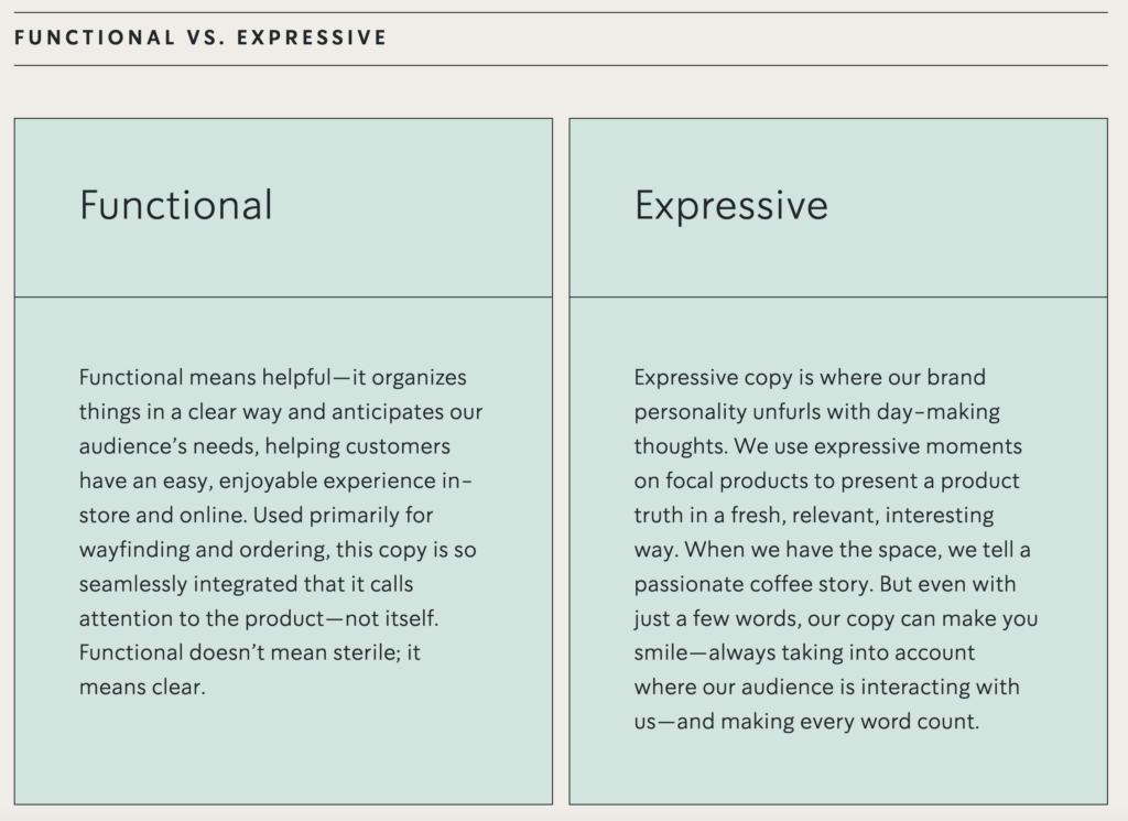
Take for instance Starbucks. (They do have a strong, consistent brand to draw from, after all!) The company actually has two voices they use, depending on when to use them: functional and expressive.
Let’s see that tone across platforms:
Instagram: Who bought the NEW White Chocolate Macadamia Cream Cold Brew? Well done, you. [Image of the product]
Twitter: Manifesting sunny coffee walks. [No image]
Facebook: **A mix of their Instagram AND Twitter posts
LinkedIn: “In case you missed it, learn about the top takeaways from the Starbucks 2023 Annual Meeting of Shareholders.” [Image with link to report]
Brand guidelines should always be a positively worded guidance for everything that should be done to maintain consistent branding. But sometimes, there are some big, “never ever do this” guidelines that should get their own section, even if you’re repeating yourself. This list may look like this:
- The company name should never, ever be spelled in any other way than this: eZmachinery
- The company logo should never, ever be stretched out or posted at a resolution that makes it appear fuzzy/distorted/poor quality.
- Curse words or defamatory language should never be used
- The last name of individuals who leave reviews should never be used when you repost those testimonials
Brand Guidelines Homework
You didn’t think we wouldn’t give you homework this week, did you? Today, we want you to open up a window on your computer, launch your favorite word-processing program, and include all the headers from our list at the beginning. For your convenience, here they are again:
- Your Mission Statement, Your Vision Statement, and Your Core Values
- Your Company Slogan/Tagline
- Your Target Audience
- Your Color Palette
- Your Typefaces
- Your Iconography
- Your Logo(s)
- Your Internal Photography
- Your Editorial Style
- Your Brand Personality/Your Voice Across Copy and Platforms
- Your List of Don’ts
Now, write what you currently have under each item. Do you have a mission statement? Put it in. Do you have a logo? Put it in! After you’re finished inputting everything you do have, see what you are missing. Do you have a set of locked-in typefaces? What about an editorial style? Do you have variations of your logo across uses?
If you need help to put together your brand guidelines, that’s what we at digit-ALL Marketing Services love to do. Reach out if you need us.
NEXT IN OUR COMPANY BRANDING SERIES: Quiz Yourself: Good Branding or Bad Branding?
In this installment, we will test you on everything you’ve learned about branding up to this point! Are you curious to see how well you’ll do?
OTHER ARTICLES IN THIS SERIES:
- What Is Branding, and Why Does It Matter?
- What You Need Before Starting Your Company Branding
- The Problem with Inconsistent Branding
digit-ALL is a full-service marketing company that focuses on the people side of marketing. We focus on company branding, websites, social media, blogs, newsletters, and even corporate event planning. We’re here to help when you’re ready for it.
SOURCES:
“McDonald’s Colors.” USBrandColors.com.
“Starbucks Creative Expression.” Starbucks.com.
“Start with Why.” Simon Sinek, SimonSinek.com.
“The Dangers of Inconsistent Branding: Why Consistency is Key.” Steve Harvey, FabrikBranding.com.
“The Impact of Brand Consistency Report.” Demand Metric Research Corporation.